SQLEditor 3: First Preview
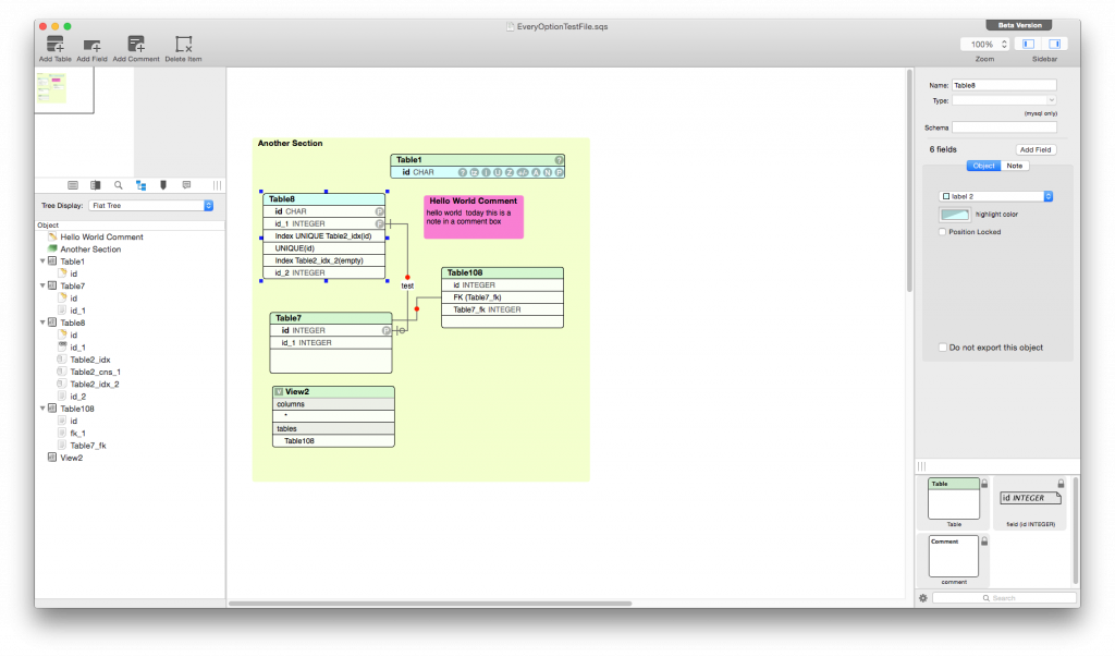
Tuesday, June 2nd, 2015Today here is a sneak peak of the new user interface in SQLEditor 3 which is in development and will be released later in the year.
The improvements visible here are mostly evolutionary rather than revolutionary.
Single Window Interface
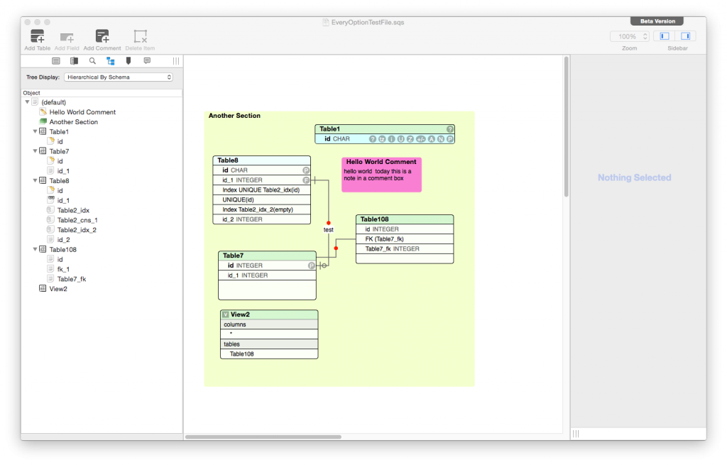
The biggest change is the single window interface. This seems to be the preferred design for apps these days, the floating palette approach seems to have fallen out of favour. This offers a major improvement on small screen devices and when in full screen mode. The palettes tended to get in the way a lot. There is a tradeoff on larger screens. Work is continuing on how to get the balance right.
The sidebars can be collapsed and you can hide the overview and palette sections entirely if you want:
Left Sidebar
The new left sidebar includes the overview at the top and the main sections below.
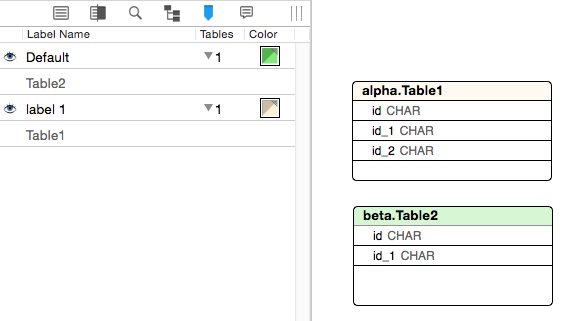
Both the labels panel and the status window have now been moved to the left sidebar.
Only status events relevant to the this document appear in its status panel.
The labels panel works as before:
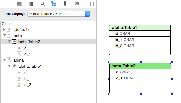
Tree View
The tree view can now show tables grouped by schema as well as the previous flat view:
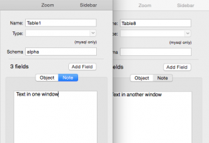
Right Sidebar
On the right side, the inspector takes the main space. Each window now keeps its inspector separately, so it is possible to have several on screen at once. This makes things like copying text from one comment to another easier, because both text views will be visible at the same time.
The palette appears at the bottom and works as before.
Next Time
SQLEditor 3 has more exciting new features and improvements, which I’ll be writing more about as we get closer to the release date.
SQLEditor 3 is due later this year, pricing to be announced.
Upgrades will be at a discount or free for recent purchases of SQLEditor

